TRACK YOUR EMOTIONS TO IMPROVE YOUR HAPPINESS
Team
Engineering: Yujun Cho, John Lee, Matthew Chiang
Design: John Lee, Matthew Chiang
The project took place from June — August 2014.
Problem
Many people today would love to have a journal to keep track of their lives and have something to look back on. The problem, however, is that journaling is a time-consuming process and it’s hard to truly know which were the important moments of your life.
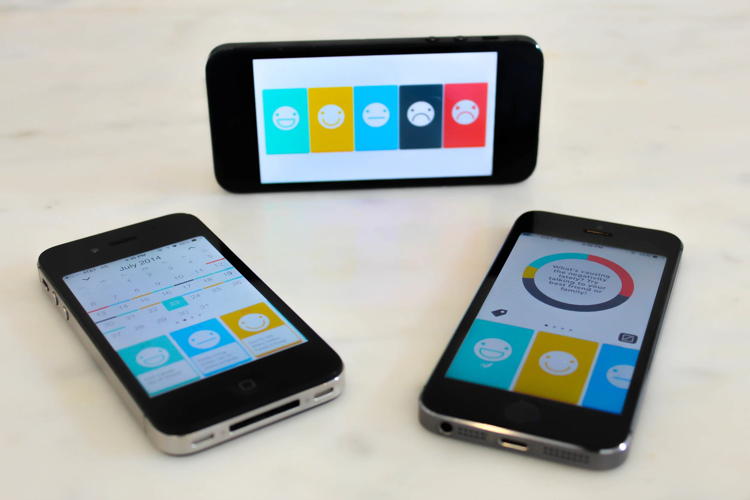
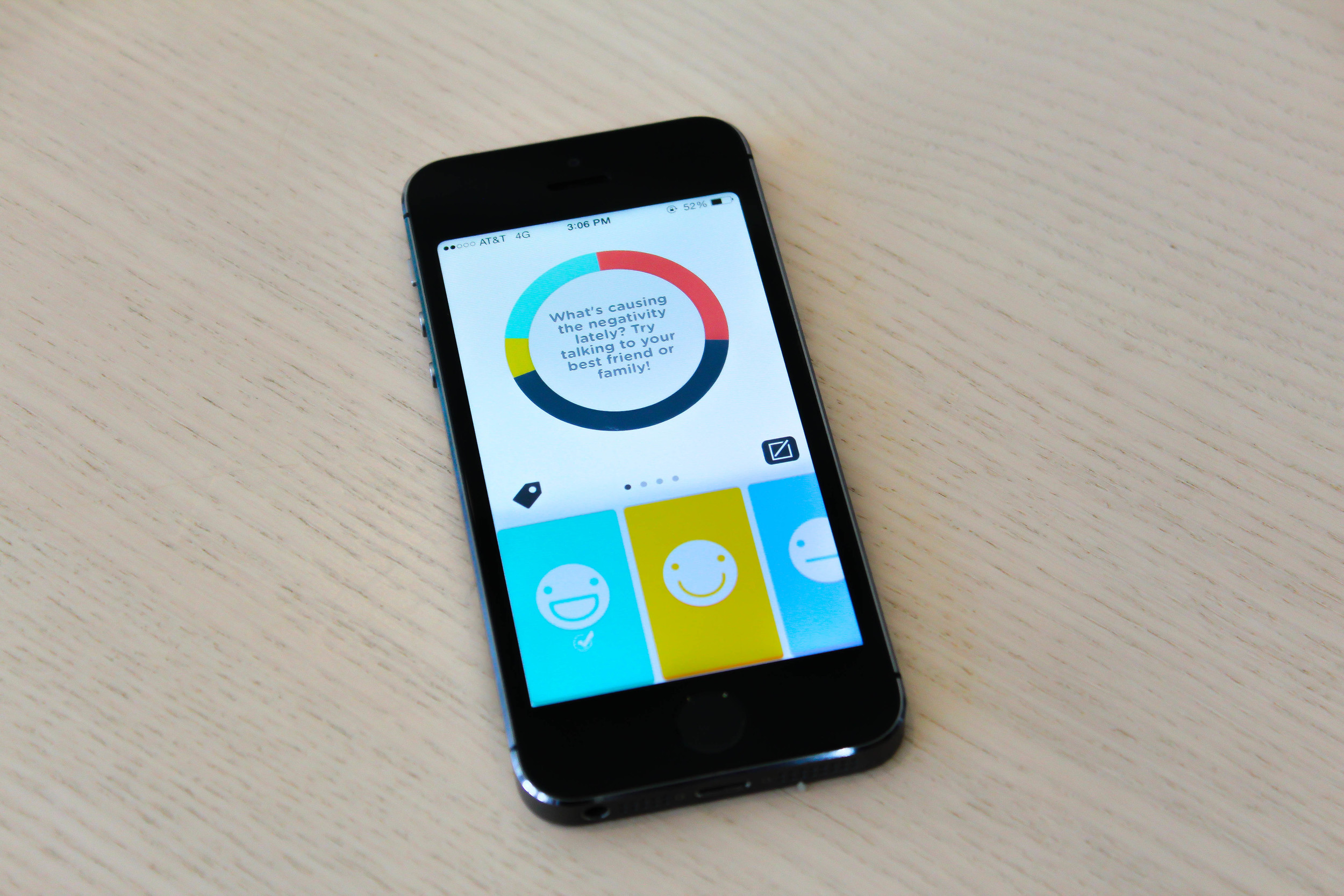
What our team wanted to do was to enable people to be able to quantify their day in a matter of seconds. With Happyness, you record your daily emotions so that you can see how you feel throughout your life and analyze yourself as time progresses.
Sketching and Competitive Analysis
In the beginning, we were focused on developing and designing an app similar to a popular competitor called Mr. Mood. The app lets you swipe through 5 simple faces to choose how you’re feeling at the end of the day.
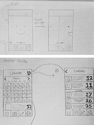
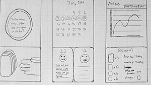
Early sketches.
At the start, we were basically trying to achieve a more simplistic version of their app and implement a few features that some of their users were asking for; it was naive.
We didn’t think deeply enough about the user and began developing as soon as we could. Looking back, the biggest change I would’ve made would have been to be user-centered from the beginning rather than be so focused on the product in our design process.
Development
We knew what we wanted and how we should go about developing our app. Execution was straightforward and a working prototype was quickly created.
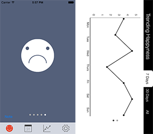
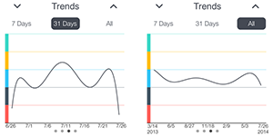
Early iterations of the home and graph views.
However, we soon found an underlying UI design problem. None of the screens had an actual theme or consistency to them.
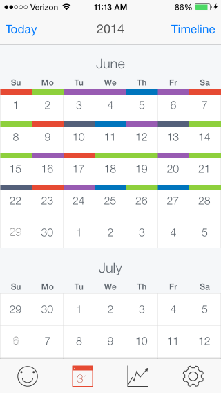
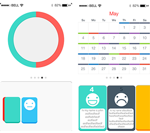
Early iteration of the calendar view.
Being a young design team, we struggled to come up with a seamless, consistent design. If I could do it over, I would make and test lo-fi prototypes in order to get the feel and experience right with users before any type of development begins.
Different design concepts we experimented with.
Sketches of what would become the final product.
One night, we were looking at Facebook’s Paper and a popular puzzle game called Threes! and tried to understand what qualities made these two app’s designs so great. With a simple color palette from Threes! and persuaded by the overall feel and look of Paper, we came up with a new design direction.
Write here...
We then surveyed our app idea with people in Berkeley to get a sense of who would be interested in our app. We received lots of feedback and comments and made the necessary changes before we got a beta version ready for users. Another change we would’ve made in our process would have been to conduct research early on in order to find out what people really wanted and justify our assumptions.
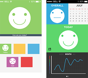
Hi-fi prototypes in photoshop.
Quantified self takes dedication, but once you log many entries, you’ll be able to recognize what should be done more frequently in your life in order to make positive changes. In the end, our goal was to better peoples’ lives by helping them improve their own happiness. Hopefully we were able to help someone out in the world do exactly that.