
Located in Queens NYC, The Noguchi Museum showcases its namesake’s works and explorations across sculpture. It’s a discrete, unassuming building next to the people’s favorite: Costco. And it was actually designed and created by Noguchi himself. We went there to check out the Japanese-style paper lamps that Noguchi is said to have popularized and modernized, but also found things we didn’t expect to.

The First Step
Immediately upon stepping into the museum, you’re thrust into a kind of deep space where gravity is defined by the weight of the sculptures surrounding you. Everything is hard here in this stone garden - from the floor to the walls to the ceilings to the sculptures themselves. They look big and they look heavy, and each one seems to pull you in as soon as you step near it like a planet pulling in a wandering meteorite. There’s a lot of space given to each piece, but it’s more necessary rather than minimalist. There’s definitely an atmosphere that encourages you to question your senses and perception of what rock is.


What caught my attention was the interplay between the natural and man-made aesthetics of each sculpture. For the most part, they look like plain old big rocks, but they have interesting shapes to them due to where and how they’ve been cut. Some of the facets are then finished with a smooth surface that results in an object having different looks. The source material is the same, stone, but it brought to my awareness the power and flexibility of it. Emphasis on juxtaposition and contradiction continue throughout the museum.
The Garden

The next part of the museum transitions from a stone garden to what we’d normally consider a garden. The foliage provides a new context for the sculptures that’s different than the previous space. Here, rocks sit amongst the greenery, contradict it, and even incorporate it.


Man talks about greenery but shot everything in black and white.

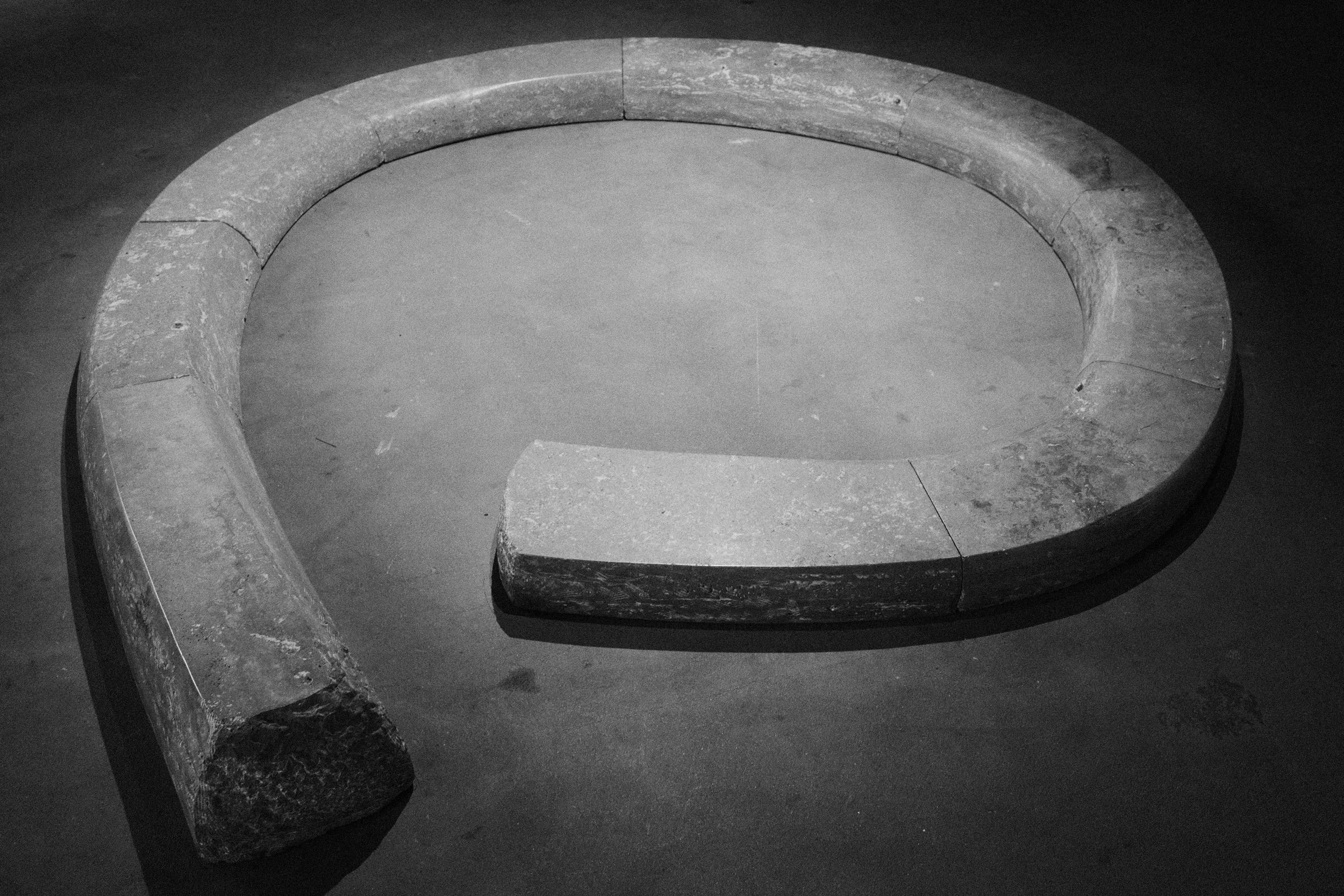
This one looks like a baguette.

One of my favorite pieces out of the whole museum is the one above of 5 rocks leaning against each other. I love the way they just hug each other. It’s so natural and comforting to look at from every angle, but there’s still something off about it. I think it’s because logically, I know that these are heavy stones that are rough because of their texture. Yet they look like pillows to me. The material’s texture contradicts its shape. This object explores a different direction than what was shown in the first space.
The Inside
The inside exhibit is where things start to evolve. Up to this point we’ve explored the materiality of rocks and how they can be rough like mountain rocks or smooth like marble countertop, but here form and shape take another step along with the introduction of color. Below are some sculptures I found interesting: black and white photos are shown next to their color versions to show how beautiful the color is and how it adds another layer to a piece.
The interior ground floor.

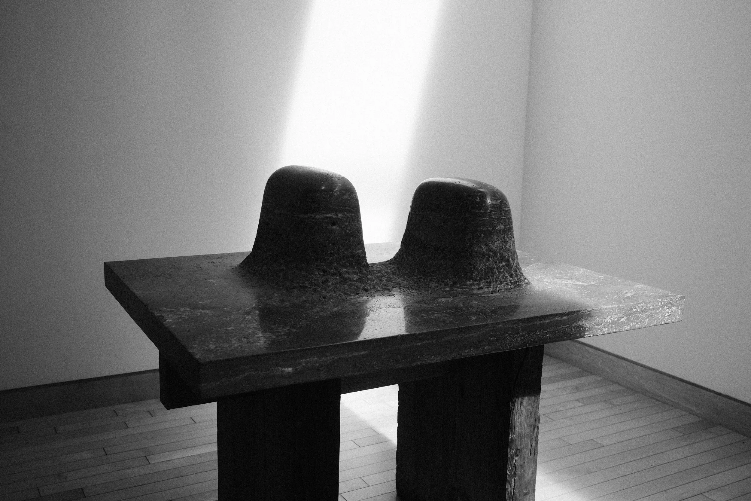
Kinda looks like a sausage.

I’m wow’d by the shape, but mesmerized by the colors and veins.
I don’t think Noguchi took himself too seriously. For example, his artist statement for Subscapes (shown later) reads so “artsy”, but the accompanying graphic of the sculpture looking at his own ding dong says otherwise. Which brings me to ding dongs, Noguchi’s most in-your-face piece might be his Ding Dong Bat made of pink and white marble. I actually think his humor is one of his strengths as it adds another dimension to his work - I’ve never seen a phallic sculpture that’s so regal and so…phallic yet conceptual and hilarious at the same time. The sheer size of the ding dong is quite impressive too. So much so that the tip needs support from another stone to even stay up.

Ding Dong Bat, 1968.
One project that Noguchi did take seriously, but never came to fruition was his Memorial to the Dead, Hiroshima. This was supposed to be an arch that rose above ground and led to a crypt below ground containing the ashes of the dead.


The Upstairs
The museum’s second level has sculptures that explore stone beyond itself. The pieces here start to take on figurative meaning and play with form and other materials in interesting ways you don’t see on the first floor.


I liked the tension of this piece. The top rock doesn’t have a lot of surface to hold onto. It looks like it should fall at any moment which adds to the tension. This piece also suggests to me that there are levels to which “man-made” can mean. The top rock is clearly sculpted, but looks more natural compared to the rectangle it’s sitting on.

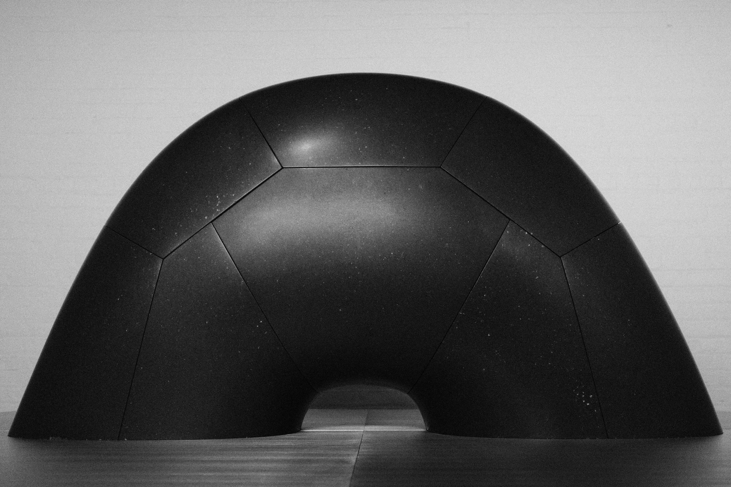
Reminds me of Arizona.

I don’t know and I don’t care, but yes.

There’s a dead plant in one sculpture and another has its head cut off, but much more is happening here! So cool.

Woah, surfaces.

Damn, look at this texture.

These cuts, sheesh.

Some of them are animals. This one’s definitely a snake. I know because the text on the wall said so.


Playing with space and the ground.

I believe this one was found looking naturally like this in a river.

The Mermaid’s Grave, 1983.
The above sculpture is another one of my favorites. It goes so hard, literally and figuratively. This could be the tomb for a horror version of The Little Mermaid.
Speaking of production sets, Noguchi did in fact do some production design and created sets for plays, and his fingerprints are clearly evident. His set design shown below is so fun, witty, and abstract all at the same time. At first I actually thought it was for The Little Mermaid, but a version where the sea is reduced to pure abstraction. Actually, the set was built for a theater rendition of Orpheus. Don’t tell me he didn’t take some acid during his lifetime.

Wiggle drop wiggle.

This is why I thought this designed for a minimalist version of Little Mermaid. A single starfish. In the entire sea.

I’m not sure what this play is going to be about, but I’m down.

:O

I really like the use of a scrim in front of an already diffused and texture-fied cloud light.

Subscapes and man bending over.


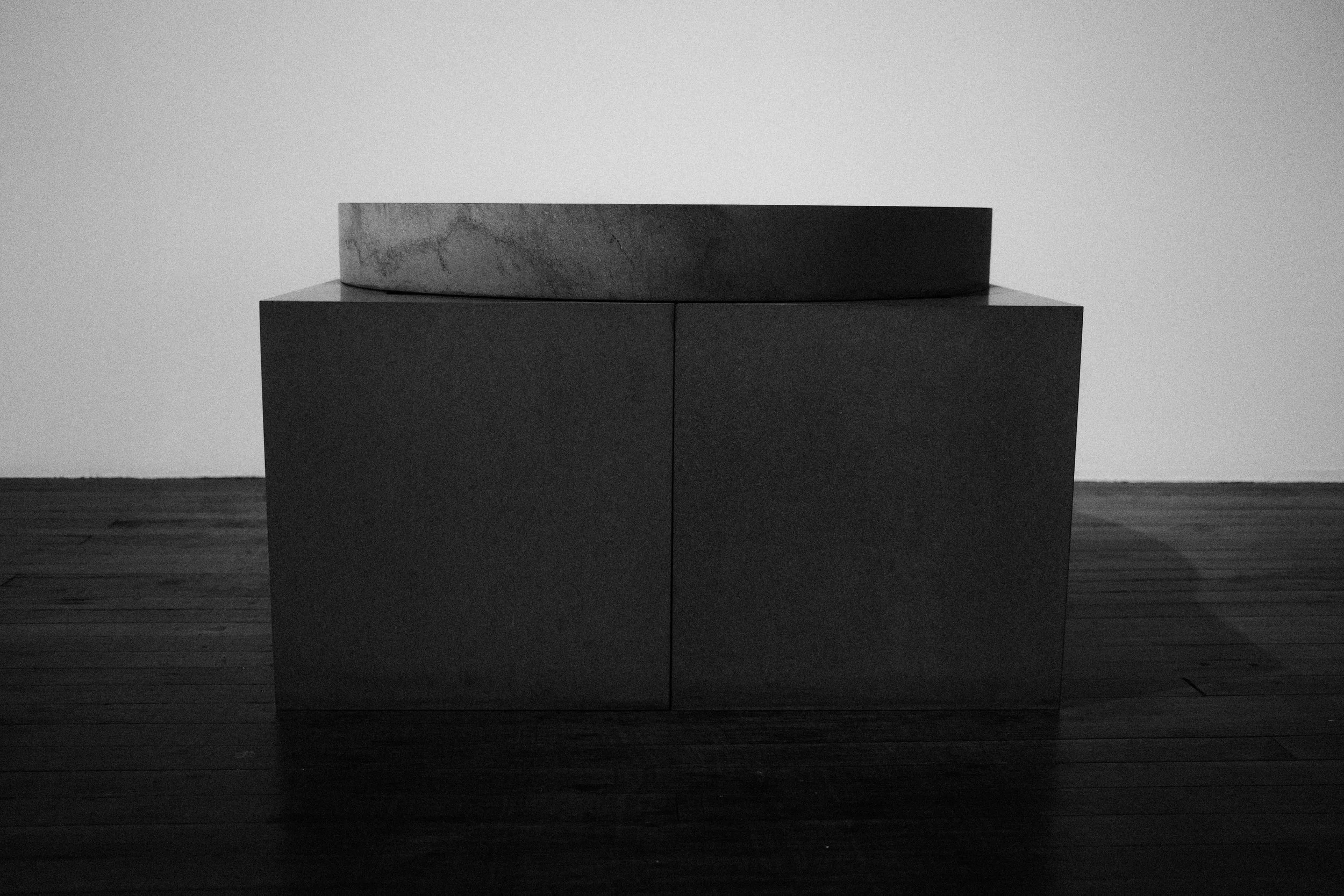
This coffee table accompanies the artist statement, but I found it to be the most normal piece out of the whole museum.
Back Downstairs

So surreal.

Those are butt cheeks and you can’t tell me otherwise. Going to this museum has developed a newfound love within me for soft forms made of hard materials like the garden pillows earlier.

I appreciate this piece, especially at the end of my visit. It summarizes to me what Noguchi is about - exploring stone, all its different properties, and how they all juxtapose with one another to make something that reveals new meanings. He mixes and mashes things together into something unique to the senses, like a mac n’ cheese made up of different cheeses. Some gouda here, some cheddar there, he’s an experimenter. His work will make you reconsider what you think you know about the terms “surface, materiality, and physicality.”
On to the best part now.
The Gift Shop

We originally came here thinking there would be a dedicated exhibition space for Noguchi’s lanterns.
It ended up being the gift shop.


My favorite lamp because it looks like a flaccid.


Buy a book and buy a lamp to read it at night.

Noguchi also dabbled in industrial design. He designed this clock.
The lamps were smaller than I thought. They’re also more expensive than I thought.
We went home empty-handed, but not empty-minded, I think.